


TMTweball - OCLO
Tracking Meteogram Jobsheet ALL
Jobsheet #1: Track Cloud-Top Temperatures and Load Additional Meteograms
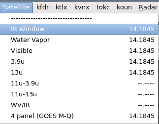
- Load an IR Window satellite product from the Satellite menu (Fig. 1)
- Zoom in to the cloud top you want to track, and step through the sequence using the arrow keys on the keyboard and skip to the last frame. From the Tools menu, load the Tracking Meteogram Tool (Fig. 2)
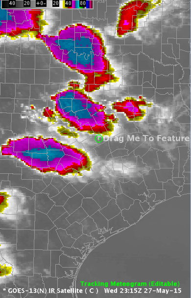
- A Drag Me To Feature icon will appear (Fig. 3)
- Move the Drag Me To Feature Icon to the cold cloud tops by left clicking inside the circle and dragging it
- Enlarge the circle with your mouse by hovering over it and using the scroll wheel to approximately match the size of the cloud top you wish to track. Do not make the circle excessively large as that could lead to undersampling of data. Prior to 16.1.2 the radius inside the circle will sample the data 10 times which may not be enough to capture your peak values (Fig. 4)
Tip: The Tracking Meteogram will linearly interpolate the position and size of the circles when you move/resize them. To avoid having to deal with circles fanning out in size from the current frame, always start on the last (most current) frame and make the initial move to the feature you wish to investigate from this last frame.
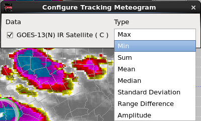
- Right click and hold inside the current frame (green) circle and select Configure Meteogram (Fig. 5)
- By default, the Tracking Meteogram will calculate and display the Max value inside a tracking circle. Since we are trying to track the coldest cloud top temperatures, we need to change the calculation to Min. So select Min from the pulldown menu under Type (Fig. 6)
- Right click and hold inside the current frame and select Toggle Circles. This action removes all circles except the current frame. The result is a cleaner display (Fig. 7)
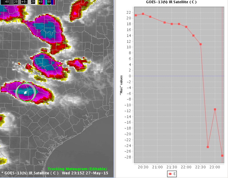
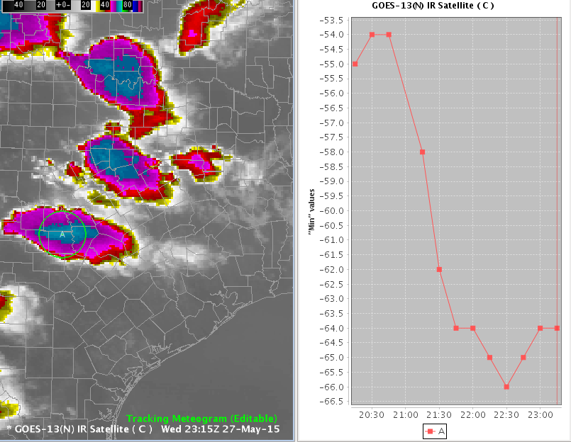
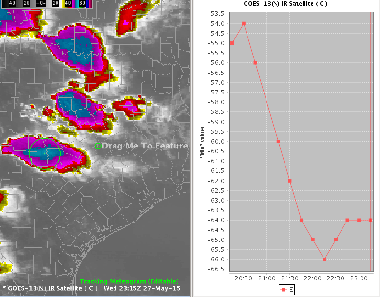
- The image below is the result of configuring the Meteogram to Min and toggling off the circles (Fig. 8)
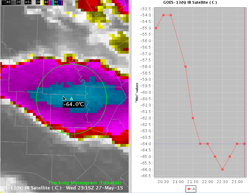
- Zoom in to the coldest cloud top and sample the cloud top temperatures with the mouse cursor and compare it to the Tracking Meteogram output. Change the magnification in the CAVE toolbar to a larger value, like 2.5, to be able to better read the sampled value and the ID letter at the center of the circle that corresponds to the line label in the graph (e.g. A). The values should match or be very close. Use the vertical red line on the plot to identify the current frame of data. Click on the line of the data plot where it intersects the vertical red line to create the dotted horizontal blue line to aid in readout of data. If the values are significantly different, try reducing the size of your circle to prevent undersampling (Fig. 9)
Tip: After interacting with the plot, you need to left-click back in the map editor to activate the toggle capability of the mouse keyboard and so you can use the arrows to step through frames.
- Click on the editor, and zoom back out. Step back to the first frame and move that frame’s circle to the location of the feature. This will trigger a good interpolation of circle positions at intervening frames. Step through each frame to make sure the circle captures the cloud top minimum temperatures. Adjust each circle position and resize accordingly to make sure that the minima is resolved (Fig. 10)
Tip: The Tracking Meteogram uses linear interpolation to adjust the size and position of circles of neighboring circles after user manipulation. Therefore it is suggested to reposition more frequently than resize, as resizing could have an unwanted impact on other circles in the sequence.
- Analyze your meteogram. In the graph above we can see the cloud top temperature minimum values significantly cooling from around -55C at 2015z to -66C at 22:30z as the storm deepens and intensifies
- To being the process of overlaying another storm’s cloud top temperature on the graph, zoom out and find another storm to analyze. Then right click and hold in the map editor display and select Add new tracking meteogram (Fig. 11)
- An additional Drag Me To Feature icon will appear (Fig. 12)
- Repeat the tracking steps on a new storm. You will not have to Toggle Circles or make the Min Configuration again because that only needs to be done once to the first Meteogram and will be inherited on any additional Meteograms in this editor. If you mess up and wish to start over, you can always right click inside the Tracking Meteogram circle you wish to delete and select Disable Line
Steps to add another meteogram:
- Zoom in on a feature on last frame with the Tracking Meteogram Tool loaded and right click in the editor and select Add new tracking meteogram
- Move circle (left mouse drag) to a feature and then resize (scroll wheel over the circle)
- Sample data and compare to graph noting vertical red line position for current frame
- Note meteograms will inherit Type configured (e.g. Min), so you won’t have to change this. If you want to change the Min calculation on the current Tracking Meteogram you can right click on the editor and select Configure Meteogram to change Type.
- Click on the editor and step back in the loop and recenter/resize as needed.
- Interrogate meteogram
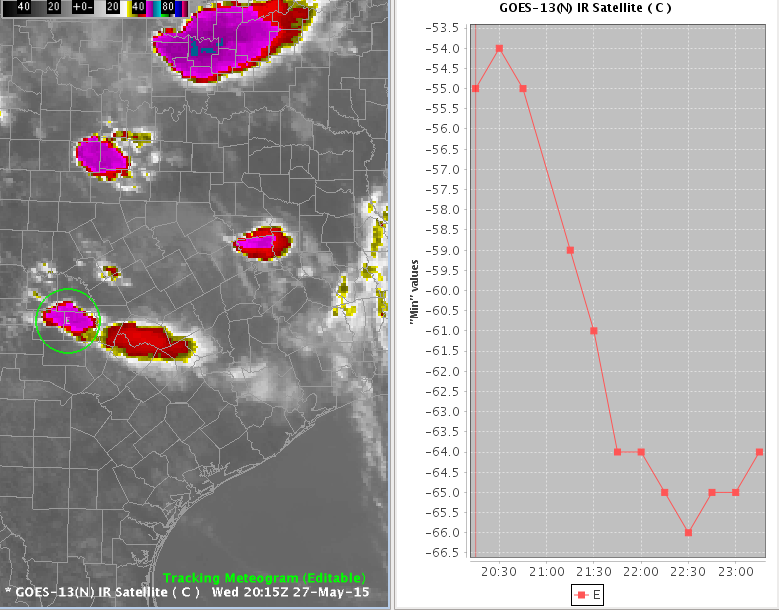
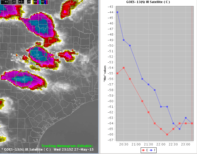
- The final display should look something like this: (Fig. 13)
In the above image, note the lines E and F in the graph correspond to the letters at the center of the circles in the D2D editor. In this example, both storms display a trend toward colder cloud-top temperatures. Thus they are getting stronger.
Jobsheet #2: Create Meteograms From a Paired Radar Product
- Load a 0.5 Z+V radar paired product. Zoom to a feature you can track in Z and toggle between Z and V using the Del key on the keypad. Use the arrow keys on the keyboard to step through the Z sequence to the last frame. From the Tools menu, load the Tracking Meteogram Tool (Fig. 1)
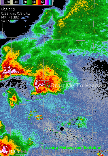
- A Drag Me To Feature icon will appear (Fig. 2)
- Move the Drag Me To Feature Icon to capture the reflectivity feature
- Enlarge the circle to the size of the feature you are tracking by hovering the mouse pointer over the circle and using the scroll wheel (Fig. 3)
- Attempt to toggle Z and V using the Del key on the keypad. This will not work, as the Tracking Meteogram breaks the functionality of this key until you click on the graph and then click on the editor (Fig. 4)
Important Tip: To recover the capability to toggle and use other keyboard shortcuts in the current map editor, left click inside the plot, and then left click back in the map editor. This will make the toggle key functional once again so you can use it to go back and forth between Z and V. Note that left clicking inside the plot will add dotted blue lines that intersect at the closest data point to where you clicked.
- Toggle back to Z (note you can also click on the text of the velocity product in the Product Legend to switch back to reflectivity).
- Right click and hold inside the current frame (green) circle and select Configure Meteogram (Fig. 5)
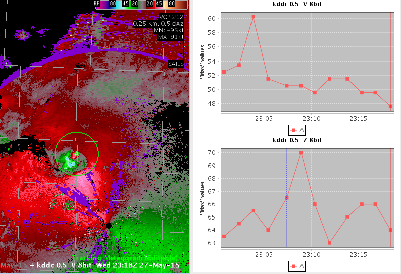
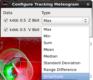
- By default, the Tracking Meteogram will calculate and display the Max value inside a tracking circle. This is fine for Reflectivity. However, suppose we want to calculate the maximum low-altitude winds associated with a mesocyclone, regardless if the Max wind is found inbound or outbound. The amplitude Type calculation will provide this.
- In the row containing the 0.5 V product, select Amplitude from the Type column (Fig. 6)
- Right click and hold inside the editor and select Toggle Circles. This action removes all circles except the current frame. The result is a cleaner display (Fig. 7)
- The image below is the result of toggling off the circles and configuring the Meteogram to display Max reflectivity and Amplitude of Velocity (Fig. 8)
Note: You may have to adjust the circle position to adequately capture both max Z and strongest V in your tracking area. Go ahead and resize and reposition the circle to capture both the reflectivity max as well as the strongest velocity if needed. If the Del key toggle doesn’t work, click on the graph and then the editor.
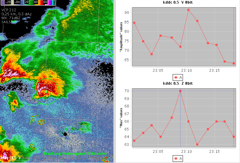
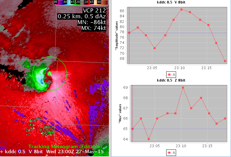
- Zoom in to the reflectivity feature you are tracking and sample the reflectivity with the mouse cursor and compare it to the Tracking Meteogram output. Change the magnification in the CAVE toolbar to a larger value, like 2.5, to be able to better read the sampled value and the ID letter at the center of the circle that corresponds to the line label in the graph (e.g. A). Use the vertical red line on the plot to identify the current frame of data. Click on the line of the data plot where it intersects the vertical red line to create the dotted horizontal blue line to aid in readout of data. The values should match or be very close (Fig. 9)
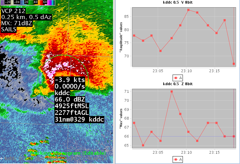
- In this example, the data is being undersampled as the Meteogram’s value of 64.5 dBZ (from the plot) is less than the CAVE sampled value of 66 dBZ. This is because the Meteogram’s 20x20 grid around the circle is too large to resolve the peak values. Thus, we need to reduce circle size to address undersampling. If your strongest Z and V values sampled are significantly different than what is plotted at the current time (note vertical red line), try reducing the size of your circle to prevent undersampling The image below shows how shrinking the circle size addresses the undersampling and results in a match (66 dBZ) between the CAVE sampled value and the Meteogram computed value (Fig. 10)
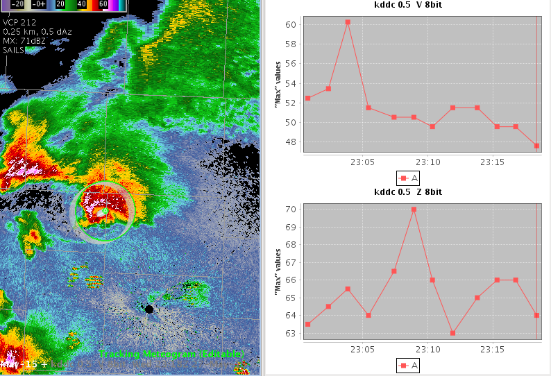
- Zoom back out, step back to the first frame, and move that frame’s circle to the location of the feature. Step through each frame to make sure the circle captures the features in Z and V. Adjust each circle’s position accordingly (Fig. 11)
- In the above example we see max reflectivities spiking to 69 dBZ and strongest velocities increasing to 86 kts
Jobsheet #3: Create Meteograms From Multiple Stacked Grid Images and Use Snap All Points To This Location
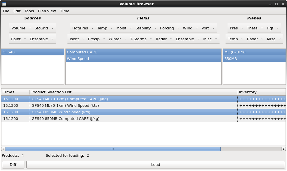
- From the Volume Browser (Browser…menu in the Volume menu), load the GFS40 850 mb wind speed (or isotachs) product and stack it with the Mixed Layer (0-1 km) CAPE product. Here’s an example of what the Volume Browser will look like before you click Load (note your VB menus may be different): (Fig. 1)
Source->Volume->GFS40, Fields->Wind->Wind Speed, Planes->Pres->850MB
Source->Volume->GFS40, Fields->T-Storms->Computed CAPE, Planes->Misc->ML (0-1km)
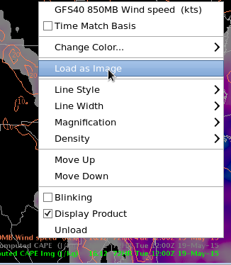
- Once you have the products loaded in the map editor, right click on each of the two products in the Product Legend in the bottom right and select Load as Image, to make the data compatible with the Tracking Meteogram (Fig. 2)
Tip: To avoid the clutter of having two different image plots loaded on top of each other, toggle off one of the image plots and replace it with the default contour plot of that product. The products do not have to be active in the Product Lgend for the Tracking Meteogram to be able to perform calculations on that product. You may have as many inactive image products loaded as you wish. The Tracking Meteogram will perform calculations and display a separate line plot for each of them.
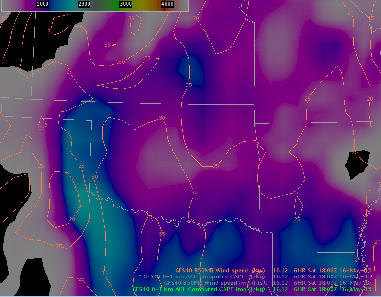
- The result should look something like this: (Fig. 3)
- From the Tools menu, load the Tracking Meteogram Tool (Fig. 4)
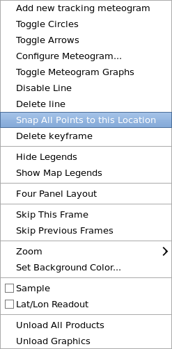
- A Drag Me To Feature icon will appear. Zoom in to a location you wish to create a time series for. Move the circle to the point you wish to create a time series for. Right click and hold inside the current frame circle and select Snap All Points to this Location (Fig. 5)
- This results in all circles being moved to the same location so you can make a time series at a point (Fig. 6)
- Notice in the above example that there are two graphs, one for each stacked image loaded. If you were to load another image in the editor (remembering to convert contour to image), you will get a third separate plot
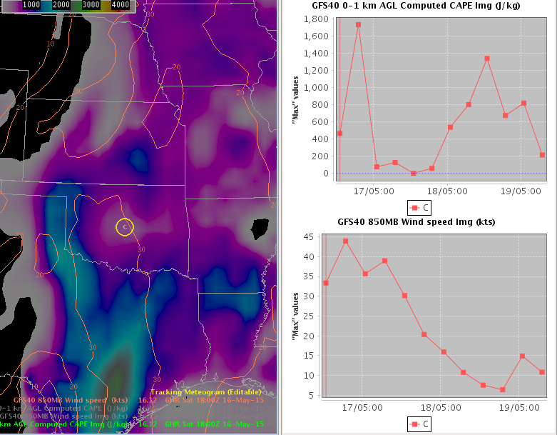
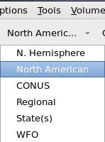
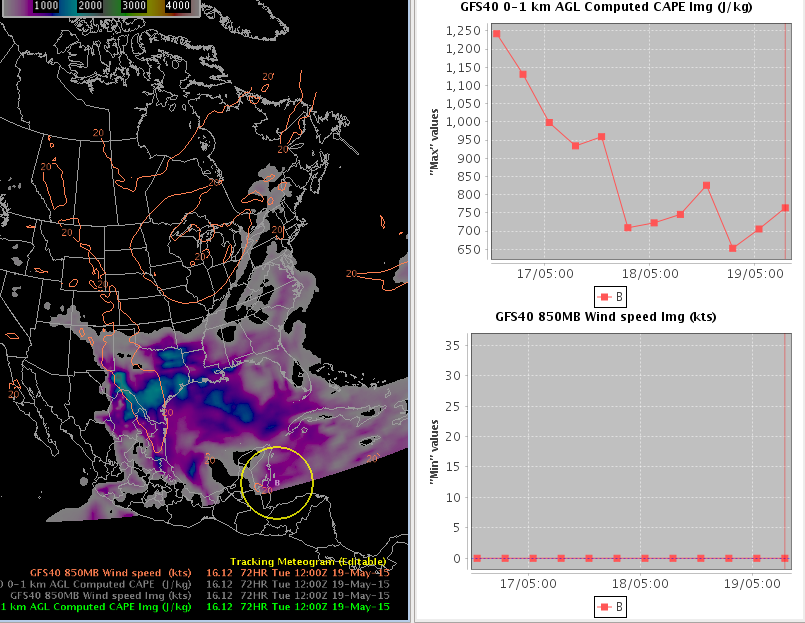
- If any of your circles are outside of the domain, the axis in the plot may become skewed to accommodate the missing data (many times are values of zero). To see this, change the scale to North American and use the scroll wheel over the circle to make the circle huge (Fig. 7)
- Configure the 850 mb windspeed to Min by right clicking on the circle and selecting Configure Meteogram. Select Min under Type on the row containing 850 mb windspeed. Move the Meteogram circle outside the domain and observe the change in behavior of the plots (Fig. 8)
- Missing data will result in the time trend plots sometimes displaying unwanted values, like zero in the above 850MB Min Wind Speed (your values may be different). Since part of the circle is still in the domain in the above image, the top CAPE plot is not affected because it is configured to Max and therefore will still find non-zero pixels to sample. The Min configuration automatically results in a zero value even if only a single data cell in that circle ends up outside the domain
- Move the circle back to somewhere in the center of the display and verify that the axis is not skewed
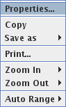
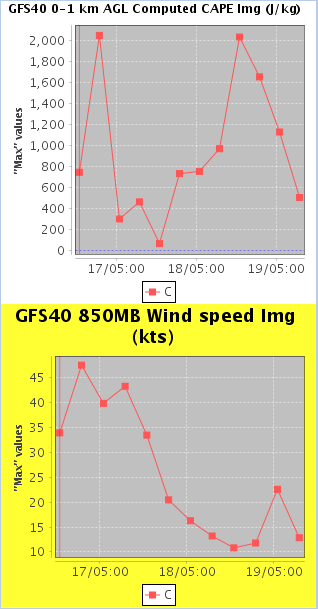
- Next, practice modifying the properties on the time trend plot itself. Right click on one of the graph plots and select Properties (Fig. 9)
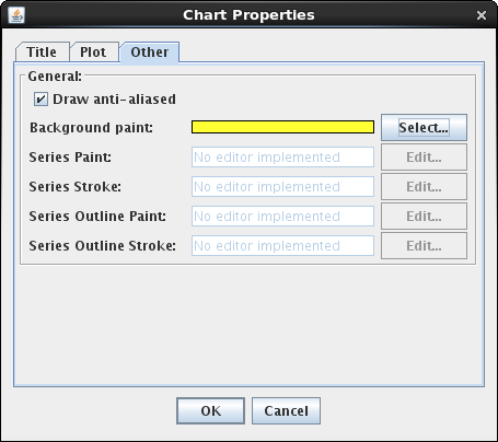
- Under the Other tab, click on the Select button next to the Background paint to launch the color chooser, and select yellow as the color and click OK (Fig. 10)
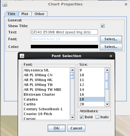
- Under the Title tab, click the Select button to change the font size to 18 and click OK (Fig. 11)
- In the Chart Properties window click on OK to apply your settings. The result is a yellow background and larger size title for the plot you right clicked on (Fig. 12)
You can modify lots of graph properties for the current session to make an image for a presentation or web graphic. Note that modifications to the graph properties cannot be saved.
Next we are going to show an aviation example using stacked grid products.
-
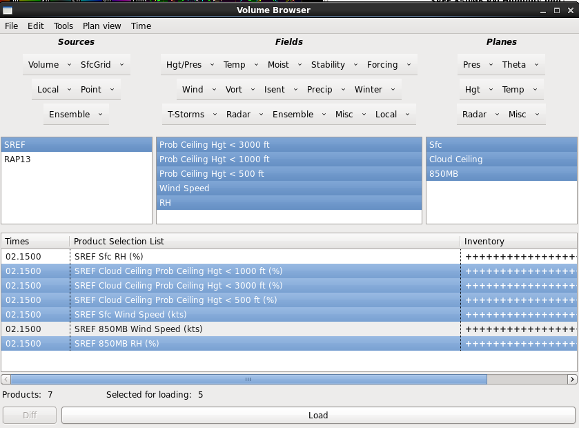
Clear the pane and use the Volume Browser (Browser…menu in the Volume menu) to load the following products on the CONUS scale:
SREF Sfc Wind Speed (kts)
Sources->Ensemble->SREF, Fields->Wind->Wind Speed, Planes->Misc->Sfc
850MB RH (%)
Sources->Ensemble->SREF, Fields->Moist->RH, Planes->Pres->850MB
Prob Ceiling Hgt < 500 ft, < 1000 ft, and < 3000 ft
Sources-> Ensemble ->SREF, Fields->Ensemble->--SREF-- Aviation->Prob Ceiling Hgt < 500 ft, Planes->Misc->Clouds->Cloud Ceiling
Sources->Ensemble->SREF, Fields->Ensemble->--SREF-- Aviation->Prob Ceiling Hgt < 1000 ft, Planes->Misc->Clouds->Cloud Ceiling
Sources->Ensemble->SREF, Fields->Ensemble->--SREF-- Aviation->Prob Ceiling Hgt < 3000 ft, Planes->Misc->Clouds->Cloud Ceiling
Note the Aviation field has both SREF and GEFS, and we want SREF. If you choose to load all the products in at once, you will need to toggle off Sfc RH and 850mb wind speed, and the Volume Browser should look like this before clicking Load (Fig. 13)
-
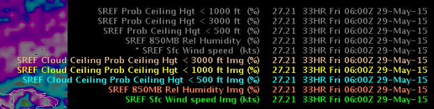
Left click and drag the map to the left to put some black space behind the text legends to make them readable
-
Left click on each product legend to Toggle off all the contours. Then work from the bottom up to right click on each product legend to perform Load as Image on the five products loaded (Fig. 14)
-
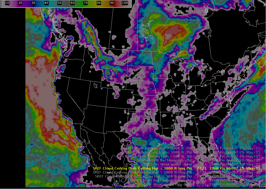
Left click on the Img product legends except Prob Ceiling Hgt < 3000 ft to toggle them off and make the < 3000 ft product visible. This is the product we will use for spatial visualization. Left click and drag the map back to the right to re-center the map (Fig. 15)
-
Your CAVE editor display should now look something like this (Fig. 16)
-
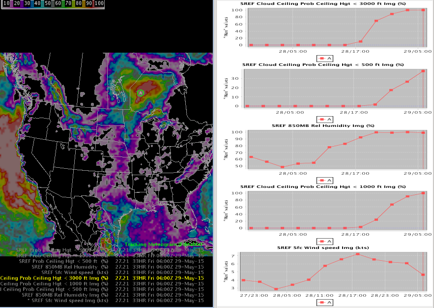
Step to the last frame and then load the Tracking Meteogram Tool from the Tools menu
-
Move the Drag Me to Feature circle to an area of red/white (100% chance of cloud ceiling < 3000 ft)
-
Right click inside the colored circle and select Snap All Points to this Location (Fig. 17)
-
Analyze the time trend plots of the maximum values of Cloud Ceiling Height plots at different layers, as well as Sfc wind and 850 mb RH (note tracking meteogram defaults with Max calculations inside the circle). In the example below at the current time (denoted with the vertical red line) the SREF is forecasting cloud ceiling probabilities around 100% at < 3000 ft and < 1000 ft layers, but only around 40% for the <500 ft layer at the current forecast hour (Fig. 18)
Note: If you want more control over the order of your plots, you can right click on each image product text legend in the CAVE editor and unload all the image plots but the one you desire on the top. Then when you right click on each contour product text legend to load each plot it will add each plot to the bottom in the order you load them. When you are done you will want to toggle on the main image you want as your spatial image in the CAVE editor and toggle the rest of the images off.
Note: The Tracking Meteogram is a dynamic tool that allows you to move the circle(s) around and see the plot(s) update. This is an improvement over the Volume Browser where you need to use separate panes to move points around.
-
Practice moving the circle around the domain and observe the plots update with each shift of the circle location. Dynamic time trends!
Jobsheet #4: Total Lightning Density
-
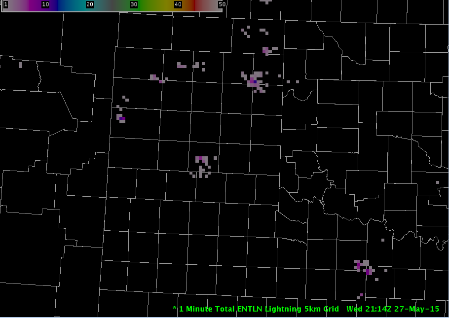
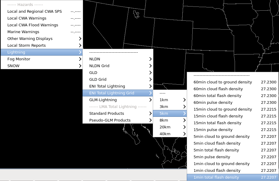
From the Obs Menu, load the 1min total flash density product on a 5km grid (alternatively you may load the 5 min plot) (Fig. 1) (Fig. 2)
-
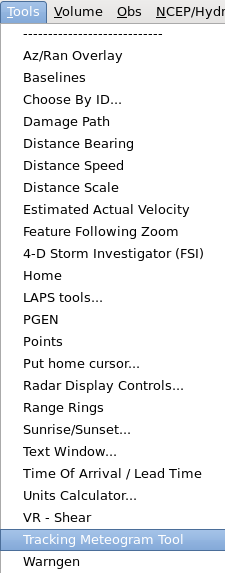
From the Tools menu, load the Tracking Meteogram Tool (Fig. 3)
-
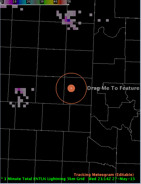
A Drag Me To Feature icon will appear. Zoom in to a location you wish to create a time series for
-
Next, confirm that you are on the last frame of data. Then resize the circle by hovering over it and using the mouse scroll wheel. Once the circle is of a desired size, drag it over the storm (Fig. 4)
Note: Resize the circle so that it captures the feature you wish to investigate without being excessively large. Huge circles can lead to undersampling of data
-
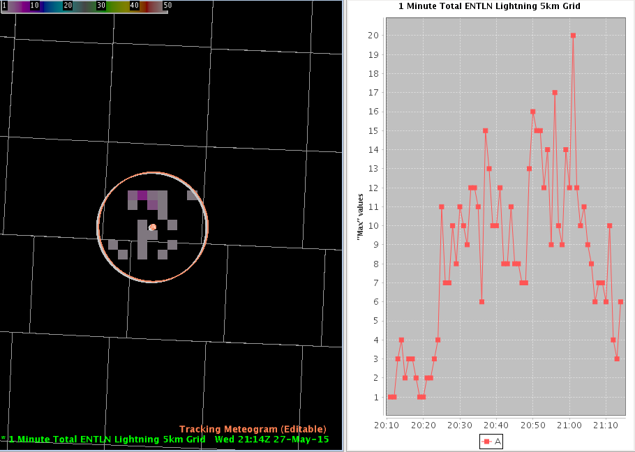
Move the circle to the point you wish to create a time series for. A time series will appear to the right of the plot (Fig. 5)
-
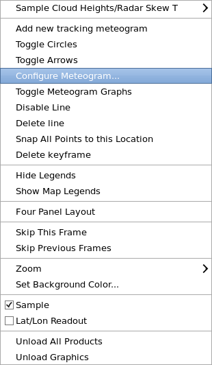
Right click and hold inside the current frame (color) circle and select Configure Meteogram (Fig. 6)
-
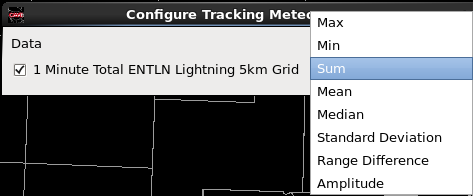
By default, the Tracking Meteogram will calculate and display the Max value inside a tracking circle. For this example we want to add up all the lightning flashes inside the circle so we will choose Sum (Fig. 7)
-
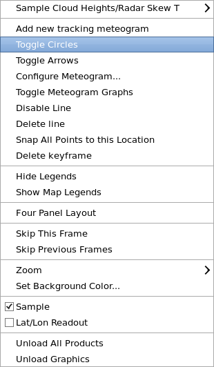
Right click and hold inside the editor and select Toggle Circles. This action removes all circles except the current frame. The result is a cleaner display (Fig. 8)
-
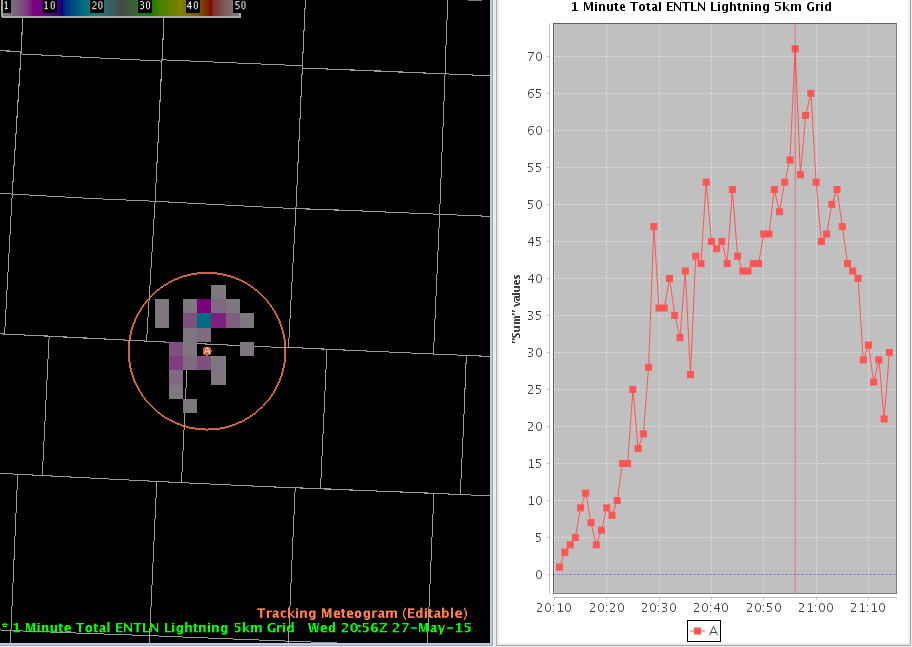
Step back to the first frame, and move that frame’s circle to the location of the feature. Step through each frame to make sure the circle captures the lightning density fields. The final display should look like this: (Fig. 9)
-
Research has shown that an increase in total lightning in a thunderstorm correlates to increased updraft strength. Thus a spike in total lightning density would suggest that the storm is trending stronger, while a decline in total lightning density would suggest the storm is weakening (although maybe just temporarily)
-
Let’s check to see if the increase in lightning density correlates with an increase in reflectivity. Load a Z product at the elevation angle which would sample the hail growth zone (environmental temperature of -20°C, -30°C, or 30-40 kft AGL would be a good place to start). In this example, I use approximately 30 kft, or the 8.0 degree elevation angle
Note: The Tracking Meteogram does not work with Radar All Tilts, so you have to pick one elevation angle and load it separately
-
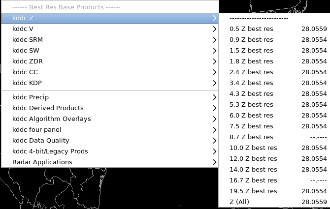
First, Clear the display. Then from your dedicated radar menu (kddc in this example), load the desired Best Res Base Product (Z) (Fig. 10)
-
Next, from the Obs Menu, load the 1min total flash density product on a 5km grid (alternatively you may load the 5 min plot) (Fig. 11)
-
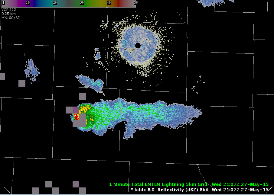
You should now see 2 stacked products displayed in the map editor: a reflectivity product and a gridded lightning density product (Fig. 12)
-
From the Tools menu, load the Tracking Meteogram Tool (Fig. 13)
-
A Drag Me To Feature icon will appear. Zoom in to a location you wish to create a time series for
-
Next, confirm that you are on the last frame of data. Then, resize the circle by hovering over it and using the mouse scroll wheel. Once the circle is of a desired size, drag it over the storm (Fig. 14)
Note: Resize the circle so that it captures the feature you wish to investigate without being excessively large. Giant circles can lead to undersampling of data. Upgrade from 20x20 to 100x100 grid in AWIPS build 16.1.2 gives the user more room for error with circle placement. However, a region-wide circle placed over a single thunderstorm will still lead to undersampling issues even with the upgraded grid size
-
Right click and hold inside the current frame (green) circle and select Configure Meteogram (Fig. 15)
-
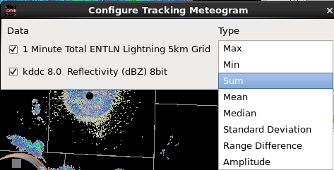
By default, the Tracking Meteogram will calculate and display the Max value inside a tracking circle. For this example, we will keep Max for reflectivity and choose Sum for lightning density (Fig. 16)
-
Right click and hold inside the editor and select Toggle Circles. This action removes all circles except the current frame. The result is a cleaner display (Fig. 17)
-
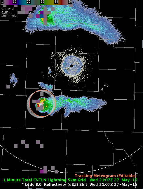
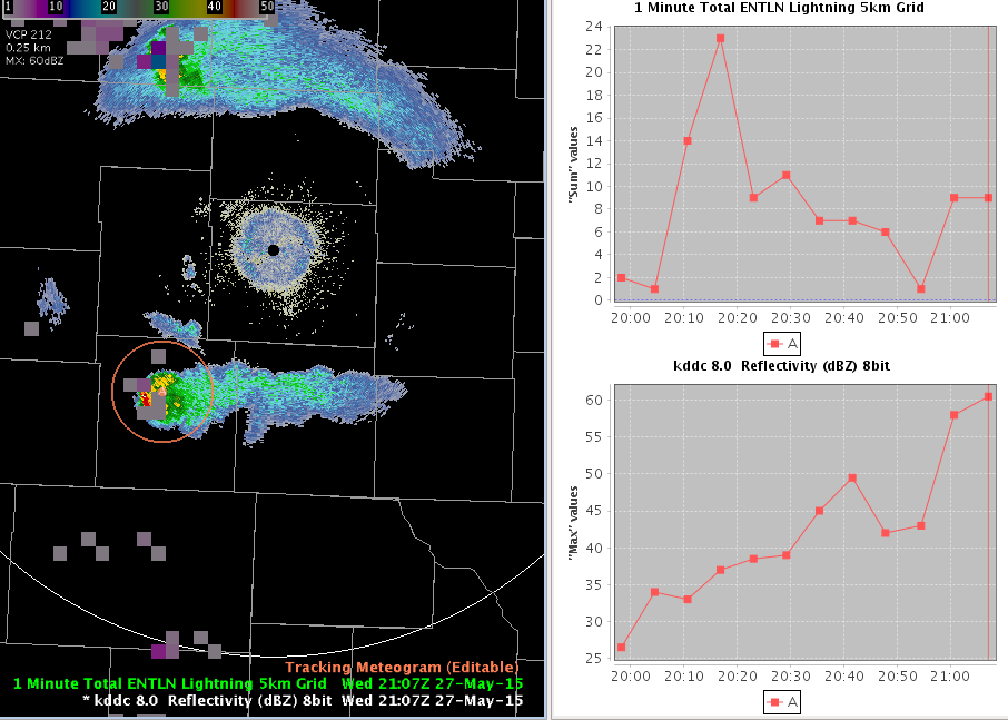
Step back to the first frame, and move that frame’s circle to the location of the feature. Step through each frame to make sure the circle captures both the reflectivity core as well as the lightning density field. The final display should look like this: (Fig. 18)
-
Looking at the time series plot, the increase in lightning from 20:05-20:15z and also from 20:50-21:05z seen on the top plot correlates with an increase in reflecivity at ~30 kft during the same time intervals on the bottom plot
Jobsheet #4: Total Lightning Density
-
From the Obs Menu, load the 1min total flash density product on a 5km grid (alternatively you may load the 5 min plot) (Fig. 1) (Fig. 2)
-
From the Tools menu, load the Tracking Meteogram Tool (Fig. 3)
-
A Drag Me To Feature icon will appear. Zoom in to a location you wish to create a time series for
-
Next, confirm that you are on the last frame of data. Then resize the circle by hovering over it and using the mouse scroll wheel. Once the circle is of a desired size, drag it over the storm (Fig. 4)
Note: Resize the circle so that it captures the feature you wish to investigate without being excessively large. Huge circles can lead to undersampling of data
-
Move the circle to the point you wish to create a time series for. A time series will appear to the right of the plot (Fig. 5)
-
Right click and hold inside the current frame (color) circle and select Configure Meteogram (Fig. 6)
-
By default, the Tracking Meteogram will calculate and display the Max value inside a tracking circle. For this example we want to add up all the lightning flashes inside the circle so we will choose Sum (Fig. 7)
-
Right click and hold inside the editor and select Toggle Circles. This action removes all circles except the current frame. The result is a cleaner display (Fig. 8)
-
Step back to the first frame, and move that frame’s circle to the location of the feature. Step through each frame to make sure the circle captures the lightning density fields. The final display should look like this: (Fig. 9)
-
Research has shown that an increase in total lightning in a thunderstorm correlates to increased updraft strength. Thus a spike in total lightning density would suggest that the storm is trending stronger, while a decline in total lightning density would suggest the storm is weakening (although maybe just temporarily)
-
Let’s check to see if the increase in lightning density correlates with an increase in reflectivity. Load a Z product at the elevation angle which would sample the hail growth zone (environmental temperature of -20°C, -30°C, or 30-40 kft AGL would be a good place to start). In this example, I use approximately 30 kft, or the 8.0 degree elevation angle
Note: The Tracking Meteogram does not work with Radar All Tilts, so you have to pick one elevation angle and load it separately
-
First, Clear the display. Then from your dedicated radar menu (kddc in this example), load the desired Best Res Base Product (Z) (Fig. 10)
-
Next, from the Obs Menu, load the 1min total flash density product on a 5km grid (alternatively you may load the 5 min plot) (Fig. 11)
-
You should now see 2 stacked products displayed in the map editor: a reflectivity product and a gridded lightning density product (Fig. 12)
-
From the Tools menu, load the Tracking Meteogram Tool (Fig. 13)
-
A Drag Me To Feature icon will appear. Zoom in to a location you wish to create a time series for
-
Next, confirm that you are on the last frame of data. Then, resize the circle by hovering over it and using the mouse scroll wheel. Once the circle is of a desired size, drag it over the storm (Fig. 14)
Note: Resize the circle so that it captures the feature you wish to investigate without being excessively large. Giant circles can lead to undersampling of data. Upgrade from 20x20 to 100x100 grid in AWIPS build 16.1.2 gives the user more room for error with circle placement. However, a region-wide circle placed over a single thunderstorm will still lead to undersampling issues even with the upgraded grid size
-
Right click and hold inside the current frame (green) circle and select Configure Meteogram (Fig. 15)
-
By default, the Tracking Meteogram will calculate and display the Max value inside a tracking circle. For this example, we will keep Max for reflectivity and choose Sum for lightning density (Fig. 16)
-
Right click and hold inside the editor and select Toggle Circles. This action removes all circles except the current frame. The result is a cleaner display (Fig. 17)
-
Step back to the first frame, and move that frame’s circle to the location of the feature. Step through each frame to make sure the circle captures both the reflectivity core as well as the lightning density field. The final display should look like this: (Fig. 18)
-
Looking at the time series plot, the increase in lightning from 20:05-20:15z and also from 20:50-21:05z seen on the top plot correlates with an increase in reflecivity at ~30 kft during the same time intervals on the bottom plot