


Ensemble Tool Jobsheet 1622 - OCLO
Ensemble Tool
Purpose:
In this example we will load the GEFS data and create the following plots from all the ensemble members: maximum precipitation plot, minimum precipitation plot, relative frequency plot, sampling display, and the histogram sampling display.Tasks:
Ensemble Tool GEFS Jobsheet (Legend Tab)
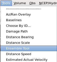
- On CONUS scale, load the Ensemble Tool from the Tools menu (Fig 1).
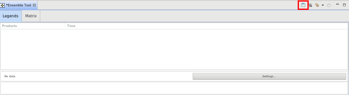
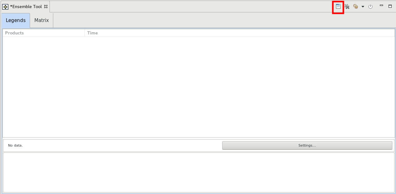
- Click on the Open Volume Browser button in the upper right part of the Ensemble Tool tab (Fig 2).
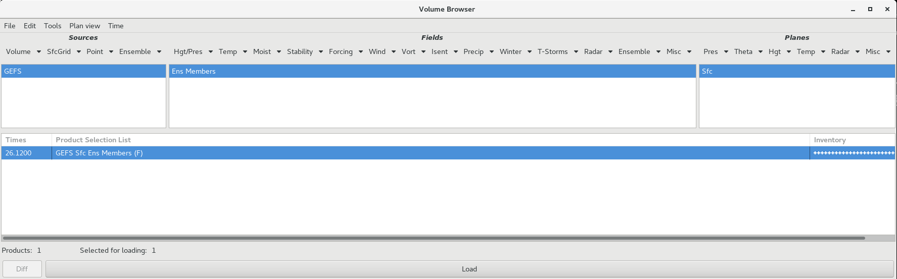
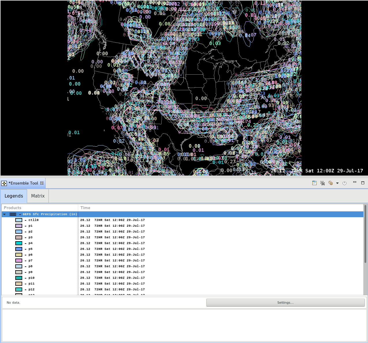
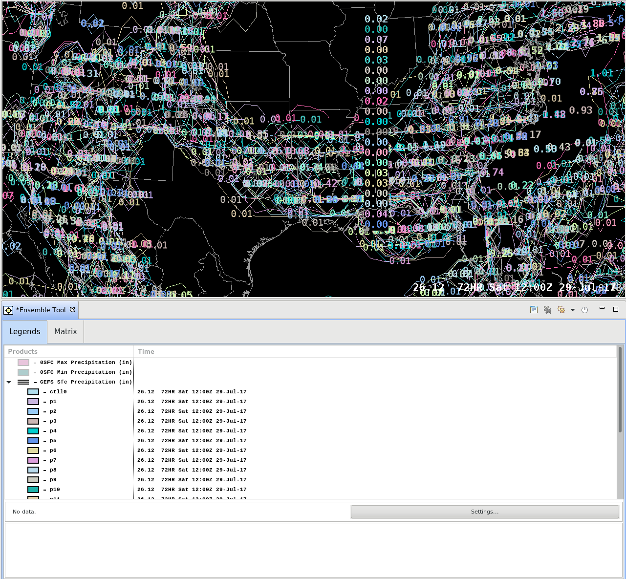
- Load the GEFS surface precip ensemble members from the Volume Browser (Fig 3, Fig 4).
Sources->Ensemble->GEFS
Fields->Ensemble->GFS Ensembles->Precip->Ens Members
Planes->Misc-Sfc (note your VB menus can be slightly different)
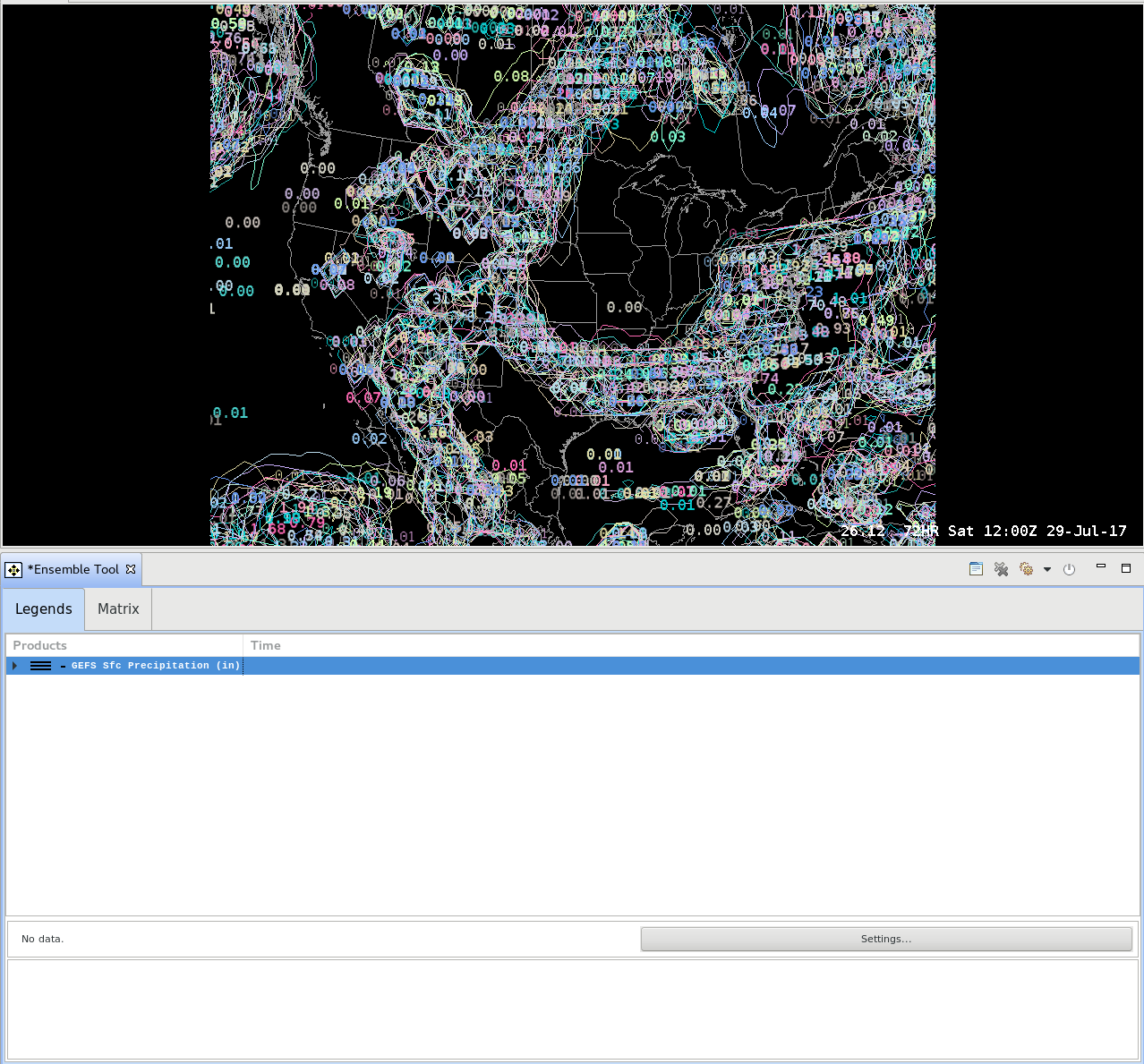
- Click on the Map editor with the precipitation members loaded, and step through the sequence until you find a precipitation area. Then in the top-left part of the Ensemble Tool, click on the horizontal triangle to expand the members. You can toggle any members by clicking on the member name, but for now keep them all toggled on. Any calculations on the ensemble members will only be done for the members toggled on (Fig 5).
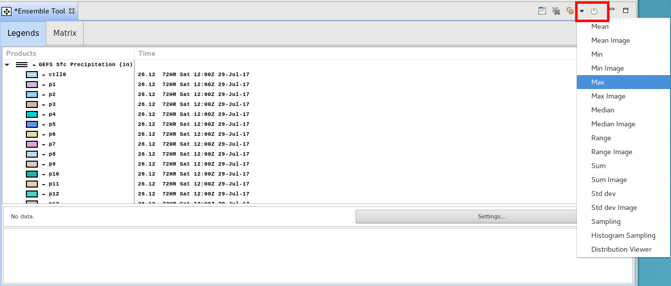
- Click on the gear button in the upper right part of the Ensemble Tool, and select Max to create a plot of max precip from all the members displayed (Fig 6, Fig 7).
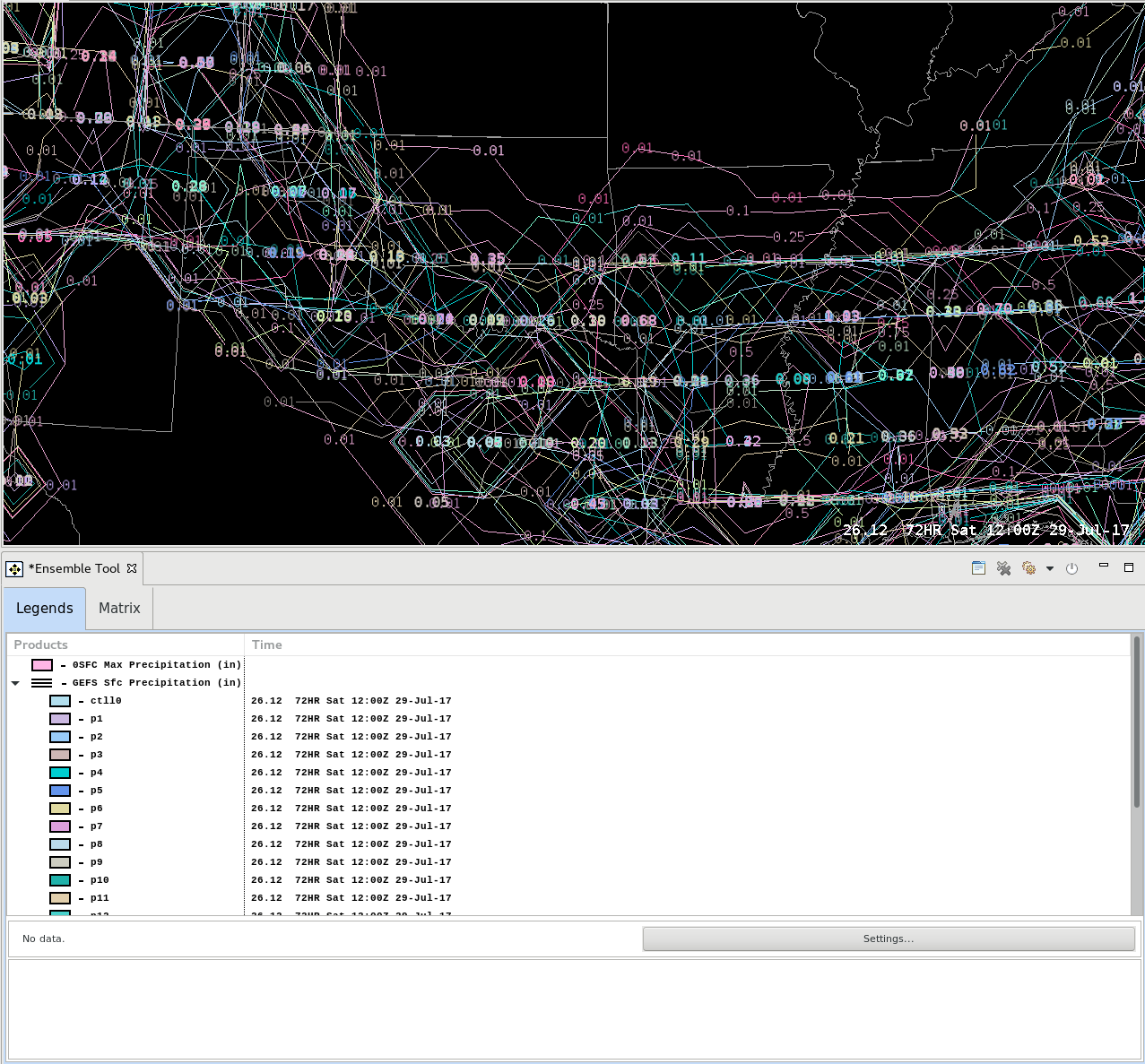
- In the Ensemble Tool, click on the three horizontal bars to toggle off the members. You may want to right click on the Max Precipitation product row and change the color or line width or magnification). Note there is no way to convert the contours to an image. The Max was created for all time steps, so you can step through the frames to see the max precipitation at each time step (Fig 8).
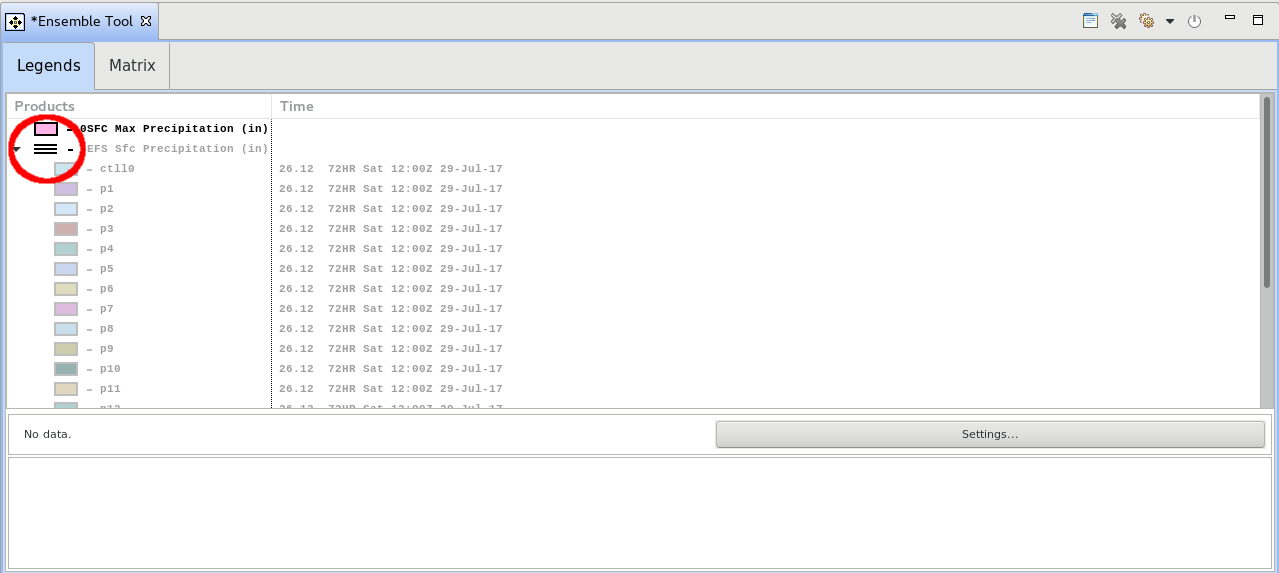
- Click on the Max Precipitation row to toggle off the max precipitation. Then click on the 3 horizontal lines with the GEFS Sfc Precipitation to toggle on all the members.
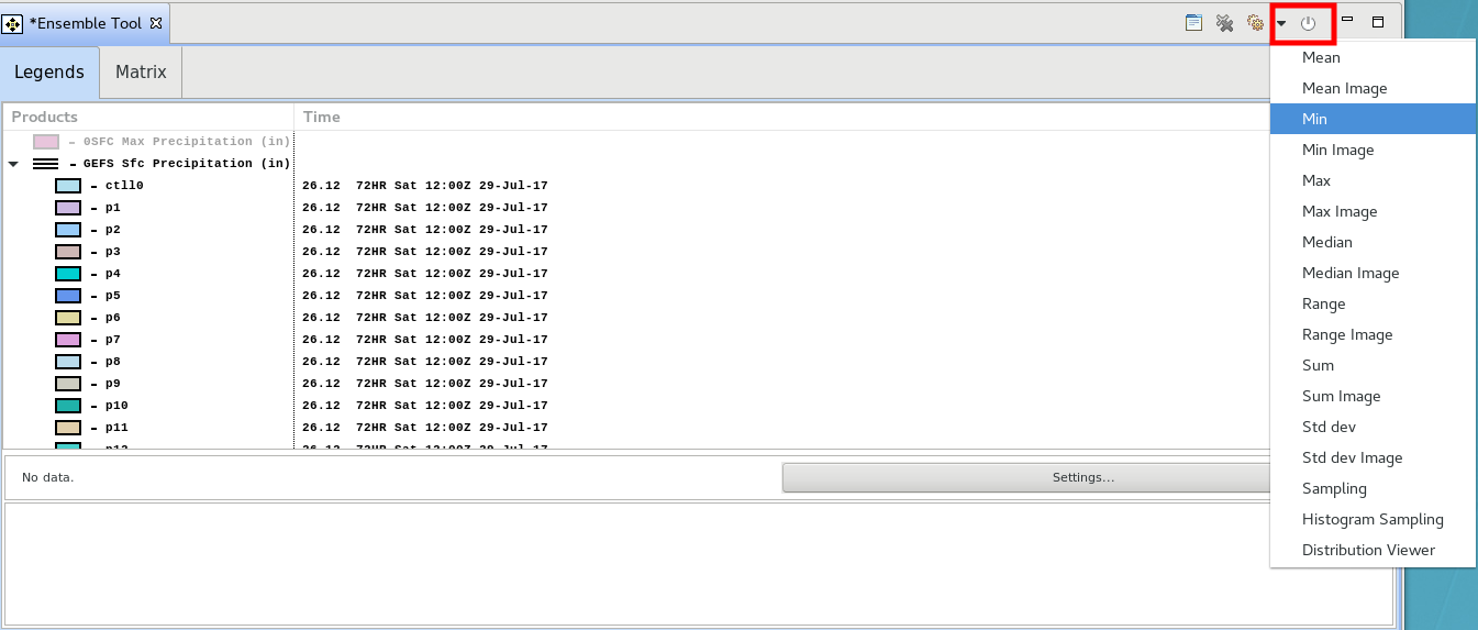
- Click on the gear box and select Min to calculate the minimum precipitation from all members (Fig 10, Fig 11).
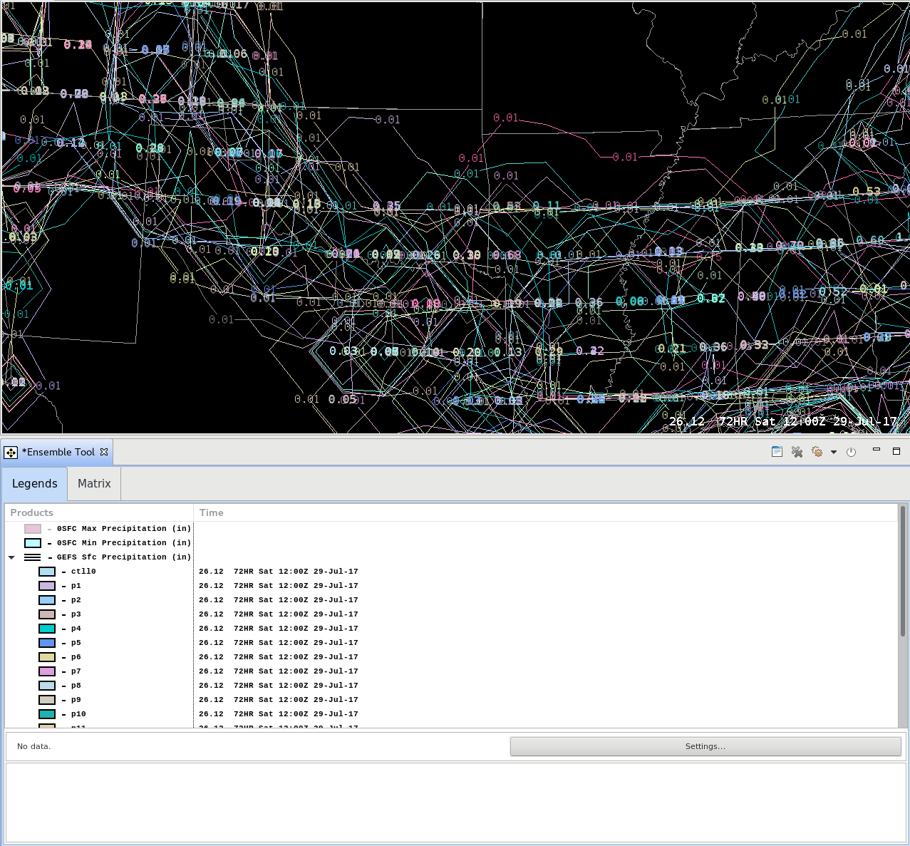
- Click on the three horizontal bars to toggle off the members and see the result (Fig 12).
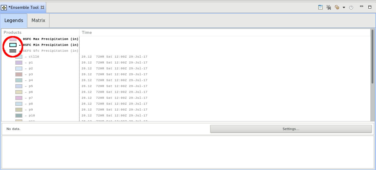
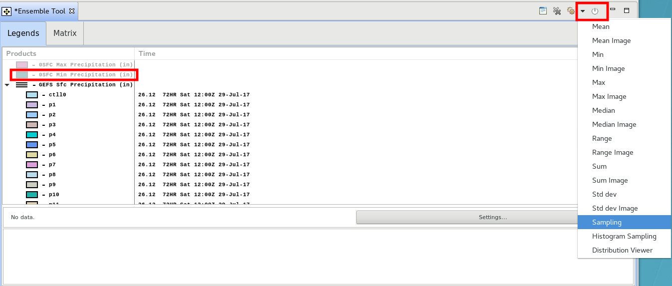
- Click on the Min Precipitation product to toggle off that calculated field, and click on the three horizontal bars to toggle on all the members. Then click on the gear box and select Sampling (Fig 13).
- Move your mouse cursor in the CAVE editor and sample out the values of the members (Fig 14).
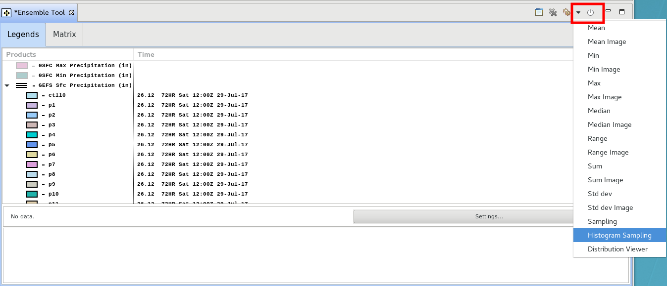
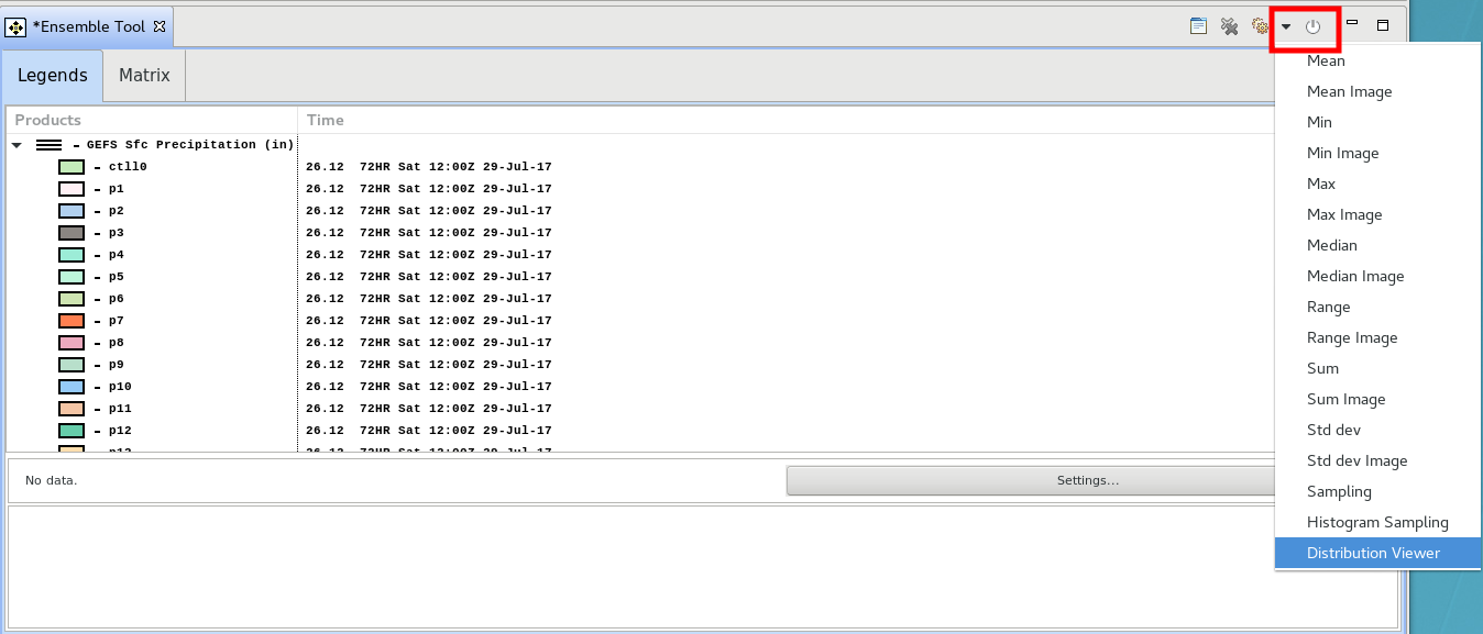
- Toggle off the sampling calculation by clicking on the Sfc in Ensemble Sampling text in the Ensemble Tool. With the members displayed, click on the gear icon and select Histogram Sampling (Fig 15).
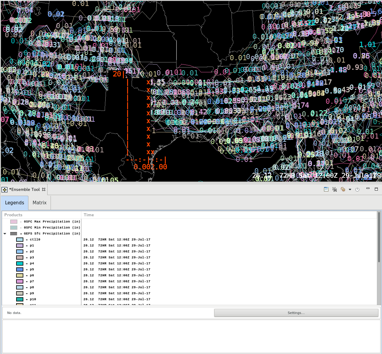
- Move your mouse cursor in the CAVE editor to sample out the values in a histogram format (Fig 16).
Note the histogram clusters the members in groups vertically that correspond to the small scale on the X-axis. The peak QPF is around 2” and the taller stack of x indicates the more common values. - Toggle off the histogram by clicking on the Sfc in Histogram Text in the Ensemble Tool. Right click on the GEFS product legend next to the horizontal bars and select Relative Frequency Image (Fig 17).
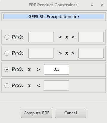
- In the Ensemble Relative Frequency (ERF) Product Constraints popup, select the checkbox for the row you want to use and enter a threshold to calculate the relative frequency for (e.g. P(x): x > 0.3 is the probability that precip is greater than 0.3”). Click on the Compute ERF button (Fig 18).
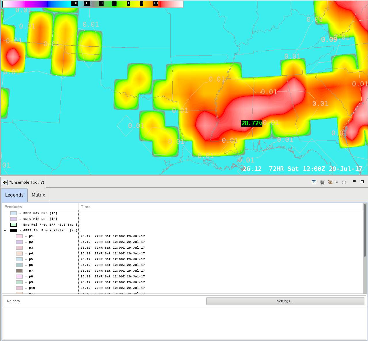
- Click on the 3 horizontal lines with the GEFS Sfc Precipitation to toggle off all the members. Then analyze the Ens Rel Freq result. The relative frequency in the GEFS ensembles of the threshold you specified will display as a percent. In the example below, over 20% of the members contained precip accumulations greater than 0.3” in the East Central Mississippi. Beware of tight gradients as displayed in the image below which may represent a lack of diversity of model solutions in the GFS (Fig 19).
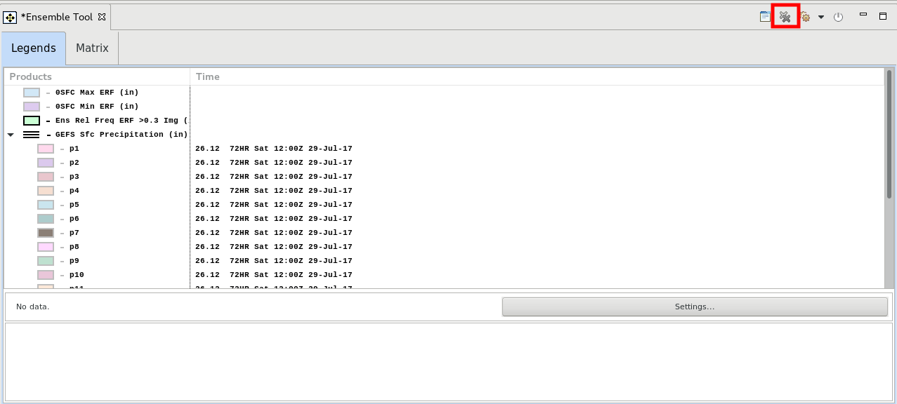
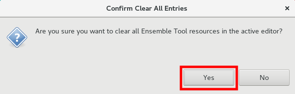
- Click on the XX clear all button on the upper right part of the Ensemble Tool, and then the Yes button on the popup to clear the display while leaving the ensemble tool open (Fig 20, Fig 21, Fig 22).
- Click on the Volume Browser icon in the upper right part of the Ensemble Tool tab to load in a dataset again (Fig 23).
- Load the GEFS surface precip ensemble members from the Volume Browser (Fig 24).
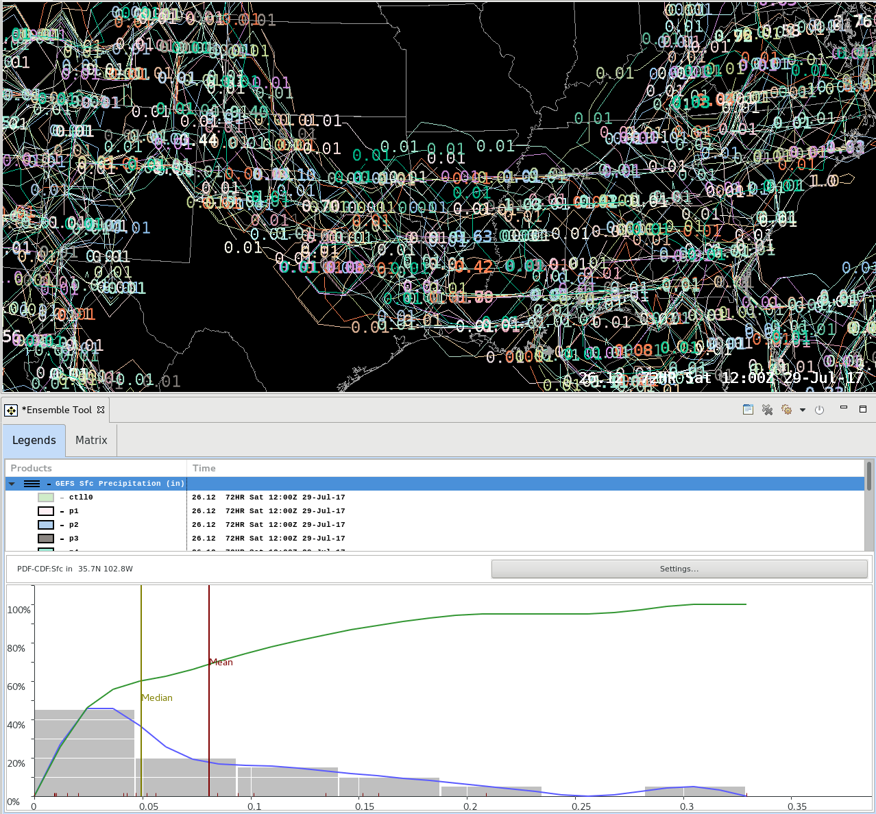
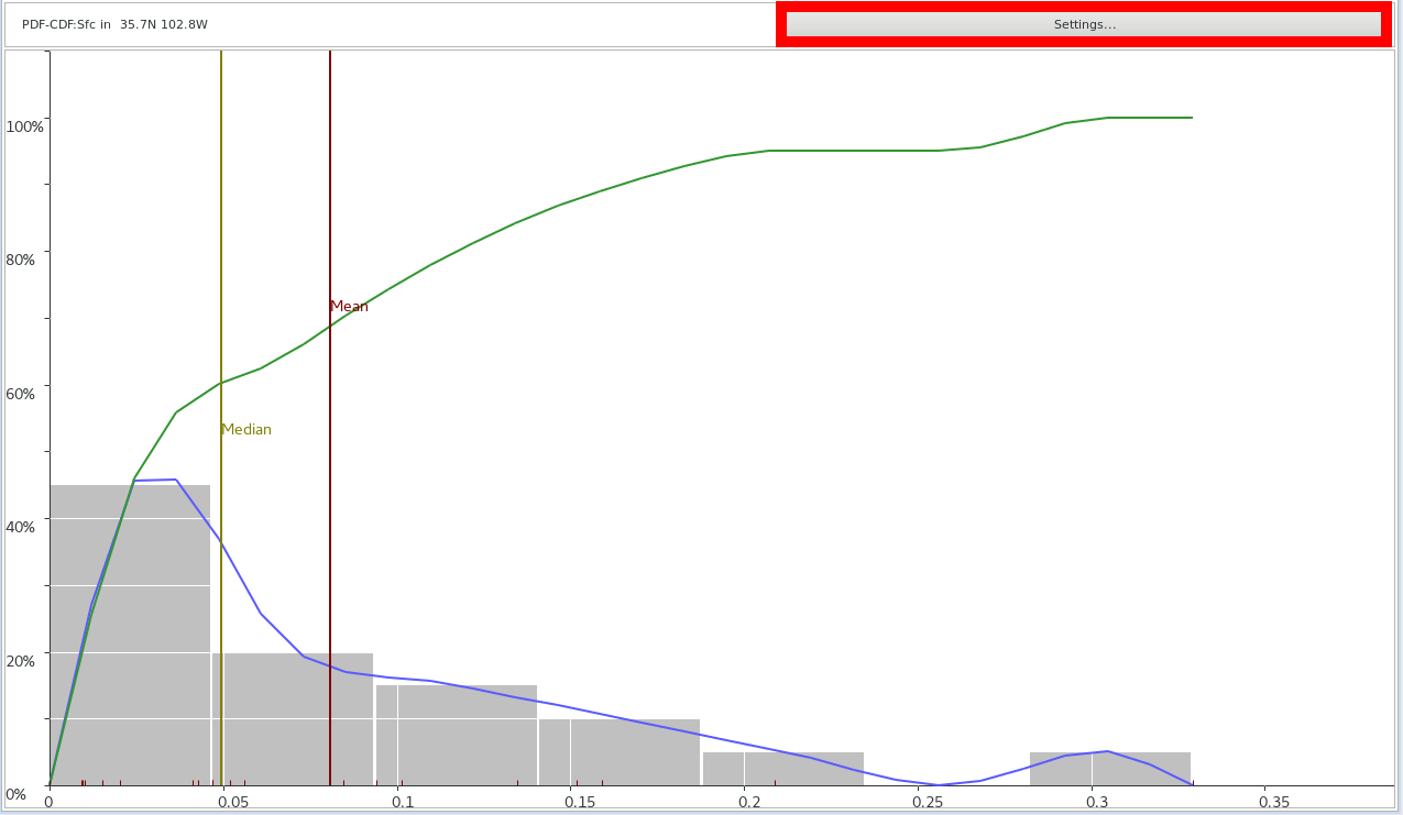
- Click on the gear icon and select Distribution Viewer. Nothing will happen until you also click in the map editor. Then a graphical plot will appear (Fig 25, Fig 26).
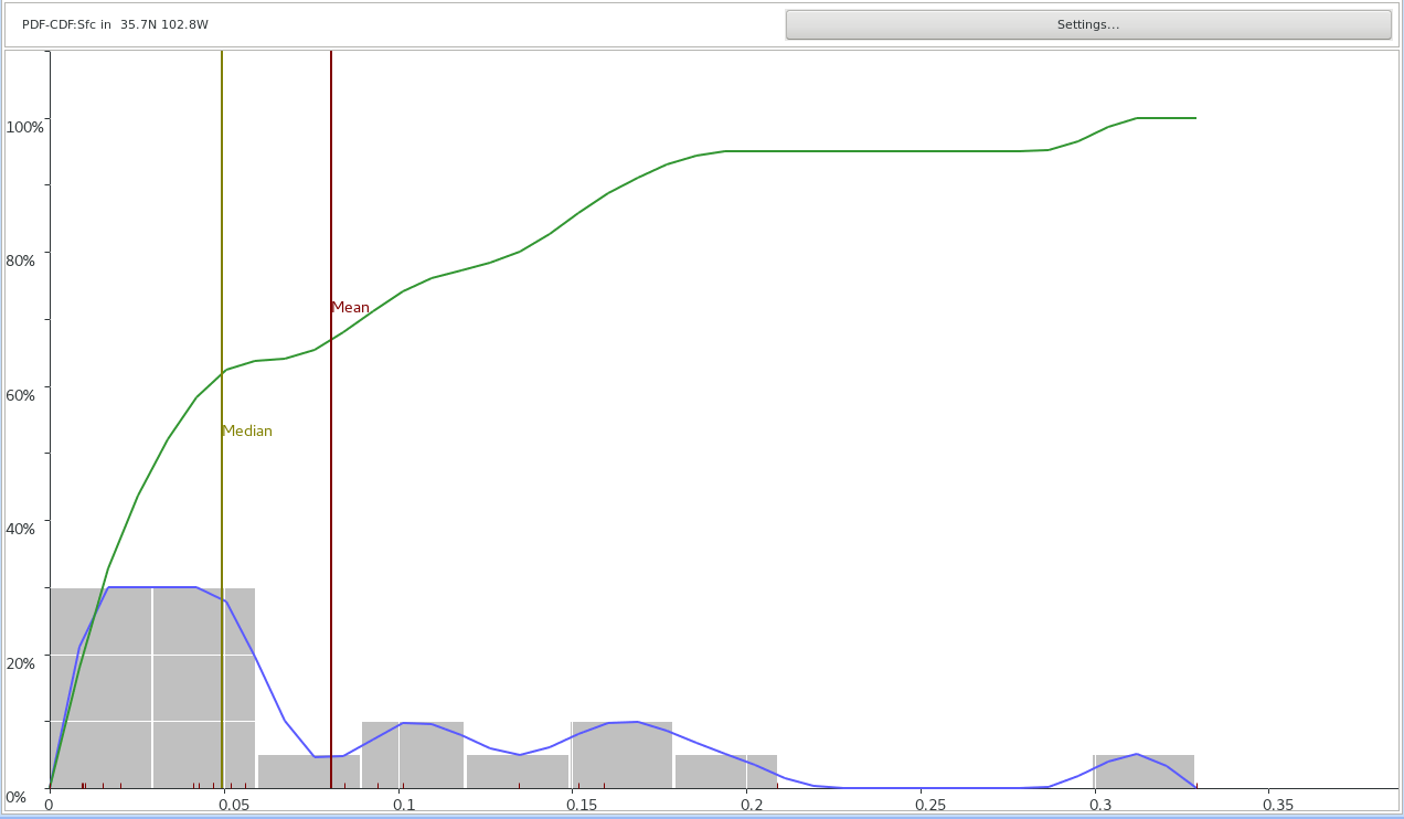
- Move the mouse cursor around in the map editor and notice the changes on the plot. You may need to click a second time in the editor to trigger the graph to update while you roam the mouse cursor and then click again to freeze the graph to a single point. There currently is no icon to show where you clicked. The Points application from the Tools menu may be useful in dropping a point at a location then clicking on that point to mark the location relevant to your graph. The x-axis in the example below corresponds to the run total QPF. The y-axis is the percentage. There are 6 noteworthy components to this plot (Fig 27).
- RED vertical line = Mean QPF of ensemble members
- OLIVE vertical line = Median QPF of ensemble members
- RED upward facing tick marks = QPF values of individual ensemble members
- BLUE curve = Probability Density Function (PDF)
- describes the relative likelihood for a variable (in this case GEFS QPF) to take on a given value
- GREEN curve = Cumulative Distribution Function (CDF)
- Describes the probability that x (QPF) will take on a value less than or equal to x
- GRAY Histogram Bars = Percent of ensemble members that fall within a prescribed bin of QPF values. The number of bins can be configured. In this example, 7 separate bins are used (e.g. 0-0.0125”, 0.0125-0.025”, etc.) and 5 of the 7 bins have precipitation and corresponding bars on the graph.
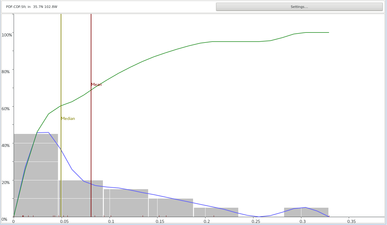
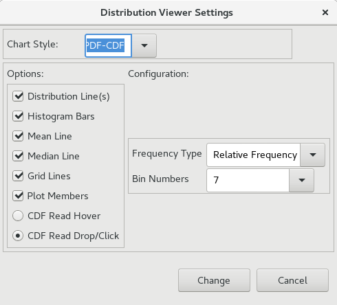
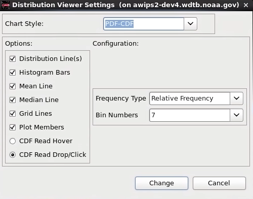
- Click on the Settings button in the top right corner of the plot to configure the distribution viewer. The Chart Style: can be set to display the PDF and CDF functions by themselves or the PDF-CDF combo which appears by default. Additionally you may toggle the display options under the Options: section. Finally, the Configuration: section allows you to configure the Relative Frequency of the bins which affects the Histogram Bars and PDF (blue line). You must click the Change button for any settings to be applied (Fig 28, Fig 29,).
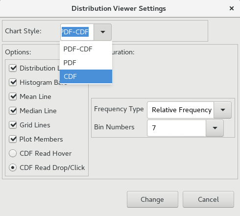
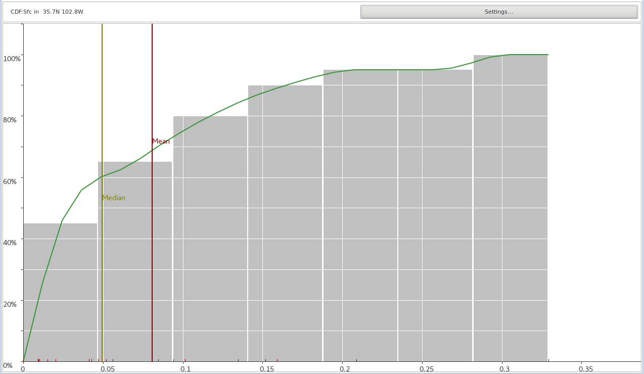
- Under Chart Style: select CDF, and click the Change button. This will make the histogram bars represent cumulative values (Fig 30, Fig 31, Fig 32).
- Under Chart Style: select PDF-CDF and click the Change button. After each change you will need to click on the Settings button to bring up the settings window again (Fig 33, Fig 34).
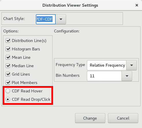
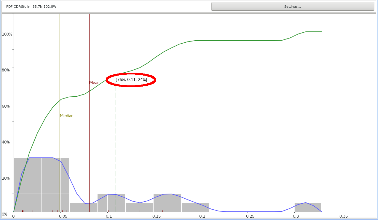
- Select 11 from the Bin Numbers pulldown menu and click Change. You should see the histogram bar intervals get smaller and the resulting PDF change. The more bin numbers, the more detail in the PDF (Fig 35).
- By default, CDF Read Drop/Click is selected. This allows the user to click on the plot and crosshairs will appear along with 3 numbers. The CDF Read Hover option allows for a continuous data interaction. With the CDF Read Drop/Click selected, click anywhere on the plot and look at the numbers. The middle number is the value (0.09” QPF) on the x-axis. The left number represents the percent of ensemble members that have less than 0.09” QPF. The right number represents the percent of ensemble members that have more than 0.09” QPF (Fig 36, Fig 37).